Unveiling the Port’s new logo
Port of Newcastle has unveiled a new logo that communicates its position as a global trade gateway embracing new opportunities and new ways to grow.
Share Article
Port of Newcastle has unveiled a new logo that communicates its position as a global trade gateway embracing new opportunities and new ways to grow.
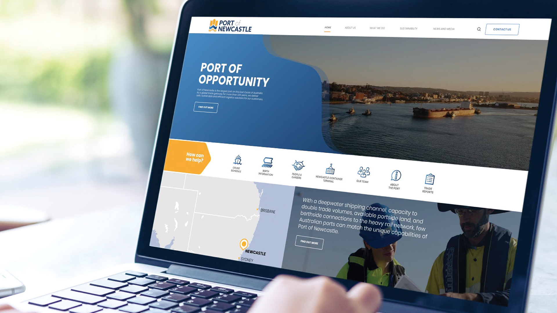
The rebrand also includes the debut of a revamped website to streamline port information and provide users with an engaging, intuitive digital experience.
The design of the new logo emphasises the diversity and daily operations of the port, with the graphics highlighting the port’s deepwater channel, the berthing of ships and the network of distribution channels that are unique to the Port of Newcastle.
It also includes a nod to a local nautical landmark, the Obelisk, and the Port’s traditional gold and blue colour palette.
Port of Newcastle’s CEO, Craig Carmody, said the new visual identity signalled an evolution for the port and provided a guiding compass for its new strategic direction.
“Port of Newcastle is embarking on an ambitious diversification that will utilise the full capacity of its assets to grow existing trade and establish new, efficient and cost-effective supply chains.
“As custodians of our region’s most critical asset, we are striving every day to create a safe, sustainable and environmentally and socially responsible Port for the future.
“In comparison to the previous logo, which focused on the iconic Nobbys Headland, we feel our new visual identity contains elements that will resonate more strongly with the port’s many international customers.
“This new logo aims to enhance the understanding of the Port, communicate our vision for the future and set a path towards achieving the opportunities that are before us.”